
Interview: Designer Sam Smith talks horror and his Criterion cover of ‘House’

In Maker’s Dozen, we ask folks in and around the film industry 12 questions and have them ask one of us.
Sam Smith (@samsmyth) is a musician, producer, and graphic artist from Nashville, TN. When not playing drums with Ben Folds, Sam designs film posters, screenprints, and other things, including cover art for The Criterion Collection. His notable Criterion covers include Solaris, Modern Times, Everlasting Moments and the 1977 cult-classic House.
For Horror Movie Month, we asked Sam about the first time he saw House, his process designing the iconic Criterion cover art, his take on the current state of horror movies, and more!
Check out the Letterboxd list of all the movies mentioned in this interview.
1). What is the Sam Smith origin story?
I grew up in Nashville as the son of an artist dad and psychologist mom. Dad set me up for creative play with records and video experiments all day long, making movies and loops. Mom took me to musicals and plays and eventually movies every Tuesday night. I binged Mister Rogers, Ed Emberley, and later, ‘90s MTV. I made home movies spinning off Batman, Dick Tracy, and Pee-Wee’s Playhouse. My first cassettes were Weird Al and The Beach Boys. In grade school and beyond, drawing and drumming were my two favorite creative pastimes, and somehow 30 years later I’m still doing both! It was at some point after film school at NYU that I saw a Cuban poster book and realized that maybe I could combine my love for film with my love for graphic design and become a poster artist.
2). Do you recall the first time you saw House? Where were you, who were you with, and what was your impression of it?
It was being passed around amongst cinephiles at the time (2007 or so), just as a bootleg. My friends from the Belcourt Theatre, with whom I would gather to watch weird and wild things at all hours, said YOU HAVE to watch it, that kinda thing. The Belcourt was getting ready to book it as a midnight screening. I watched it with my friend Matt at my condo—of course we had no idea what we were in store for and our lives were never the same! It wasn’t just that it was a “WTF” type of cult/horror movie. It was that Obayashi had tapped into something deeply psychological about youth, girlhood, beauty, loss, and grief, through a formal style that was as beautiful and poetic as it was batshit crazy.
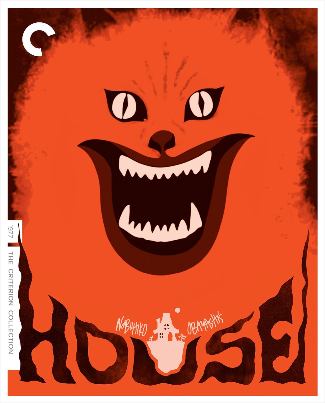
3). Talk about your process creating the House Criterion Collection artwork. Of all the wild visuals to pull inspiration from, how did you land on the cover you did?
I remember at the time really wanting to work with Criterion, as would any young cinephile designer, and coming up with this loony idea to create 25 different posters for House. I was still crashing myself through the process of learning poster design, so it was an exercise. I guess I thought that one of them would be great, or one might catch the eye of Criterion and Janus Films, who were granting this midnight release. I finished a few, and others only made it to sketch form. I certainly didn’t hit 25.
I was IMing (as we used to call it) with Zack Hall, who specialized in midnight fare for the Belcourt and was also crazy for House. We were batting ideas back and forth as the notion came up to actually print some posters for this screening, and I give him full credit for sending me the screenshot of the screaming cat and saying “or maybe something with this?” Lightning just struck my desk and probably within an hour the final poster was finished, with that orange color palette, hand-cut paper letters, a cartoon house, and hand lettering. Honestly this may have even been done before I sat down to watch the film, it was all such a blur. If that’s the case, it speaks to those moments when an idea just comes out of the ether and reveals itself, and the only job is to see it through into manifestation.
“Lightning just struck my desk and probably within an hour the final poster was finished, with that orange color palette, hand-cut paper letters, a cartoon house, and hand lettering. ”
4). You've described your illustration style as using simple shapes with vivid and bold color palettes. Which artists have had the biggest influence on your own style?
There are way too many to name! I am obsessed with poster art from all over the world, especially post-war Eastern European movements but also just the whole new wave of graphic design styles that swept the world in the middle of the 20th century. Cuban posters, as I mentioned, were the ones that really made me decide that I could do this, because they were screenprinted with minimal colors and shapes but they all expressed some conceptual idea. Polish and Czechoslovak posters do the same, and bring in amazing collage and typography that I draw from heavily. German designer Hans Hillmann is probably my all-time favorite, but he used mainly photography, which often gets a bad rap in movie posters. I draw from all of this, plus children’s illustrators, Japanese character design, architecture, really anything visual. Cinema itself!
5). You studied Cinema Studies at NYU. As a student of film, what did it feel like to hold a Criterion release with your artwork on it?
It’s the dream. Ask any film-obsessed graphic designer. Like all of them, I made my own “fake Criterions” with only MSPaint (Amelie and The Curious Case of Benjamin Button). I was wrapping up at the Cinema Studies program at NYU and my friends and I would scour Manhattan for used Criterion DVDs to build our collection. I remember specifically taking every graduation check I was generously given by various relatives and family friends, and spending the entire amount on one massive mail-order of Criterion discs.
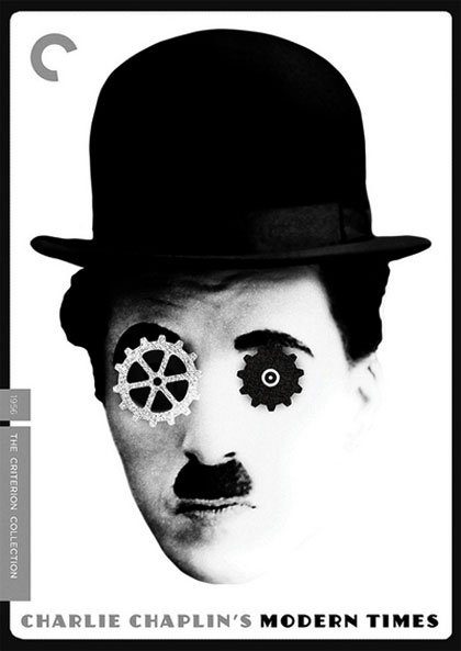
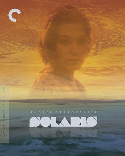
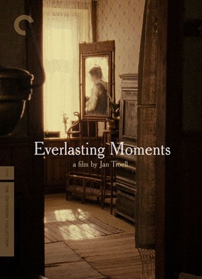
I’m a big proponent of taking in as much visual input as possible. I was crazy about cinema, and I do believe that my passion propelled me forward when it came to finding a niche where I could contribute to the business. I credit art director Sarah Habibi for assigning me a total 180-degree pivot for my first actual Criterion cover: Jan Troell’s Everlasting Moments. I love finding the right graphic style to compliment any type of film, and my assignments, from Solaris to Modern Times to the Qatsi Trilogy, all challenged me in inspiring and humbling ways.
6). How does one break into the Criterion network of artists? Is there a formal submission process or did they contact you?
I’m not sure if I have an official answer of “how” to do anything at all… but I realized early on that if I wanted to work as a graphic designer that the best strategy for getting work would be to create work that isn’t made yet, but would fit into a niche that needs filling. Mondo had inspired me to try making commemorative posters to promote film screenings on a local level: the subjects were already there (the existing programming at the Belcourt for example) and the brief and art direction was my own, since I wasn’t getting paid yet. I made the work I wanted to see made, which formed a portfolio. But in this case I knew that since Janus worked with Belcourt through programming, perhaps they might catch wind of what I was doing.
Now, images are everywhere online (believe it or not this was essentially before Instagram), but at the time the strategy was to just get my work into the right place at the right time, to be seen by the people that I’d love to work with. I still try to do that: make work that celebrates art house films and thus appeals to that audience, including its distributors, producers, filmmakers, and fans.
7). When you’re not designing, you’re out drumming with Ben Folds on tour. How have you noticed engaging in multiple art forms has influenced your creative output?
It’s just kind of what I’ve always done, having multiple octopus hands in different pots. From the standpoint of getting the bills paid, if you’re a musician then you need to have a backup career! And not to confuse this with the Gen-Z “gig economy”; I’ve always wanted to be both a musician and an artist. In middle school I was in band and did posters for school events. Music feeds the visuals, sometimes directly when I work on album covers or listen to film scores whilst designing a movie poster. And really it all feeds each other. I see the world as a museum of creative inspiration, and everything that I take in influences everything I put out.
8). You used to co-host a podcast called The Posterboys, breaking down the art of the movie poster. What movie posters do you have hanging in your house? Who designed them and what do you love about them?
I have developed a little collecting obsession, so I currently have too many to hang! I started out by saying “okay, with every big job I get, I will buy one vintage film poster that I want to have in my collection.” I have spreadsheets for the ones on my wishlist and tracking their value on websites and auction houses all over the world. When I find a good deal, I sometimes treat myself, justifying it as an investment in fine art. Long ago, Polish and Cuban posters were literally paper advertisements that were destined for the trash heap when their runs had ended. Nowadays, at least some collectors value them as the works of art that they are.
So yes, currently in my flat file I have Cuban posters, Polish posters, Japanese posters and chirashi, and some gems from the Dot Graphics era of Janus Films. Their “Donkey Skin” poster is framed in my house along with several Hans Hillmanns, Lipinski’s Juliet of the Spirits, 1OO% Orange’s Zazie Dans le Metro, Swierzy’s BLOW UP, and about a dozen more. They add color and interesting imagery to the walls, and usually spark great conversation about films, which is always fun!
9). What are three films you would love to see get the Criterion release?
They have covered almost everything now! Off the top of my head: the short films of Saul Bass including his sci-fi mini-masterpiece Quest, Bresson’s A Gentle Woman since it’s always been hard to see in good quality, and The Secret of Roan Inish, because I love children’s films based on folklore and myth.
10). You've expressed pride in making posters for great arthouse films. What’s a film or director you’d make assigned viewing for a budding cinephile interested in exploring arthouse cinema?
Well, I always assign House because it never fails, but since we’ve talked about that a bit already, I would say Koyaanisqatsi. We often forget that what we know as a typical movie nowadays is merely one of the two main branches of film styles that formed early in the medium’s history—it’s just the style that became more mainstream. On one track went the commercial, narrative film based on the theatre experience at the time. On the other track went essentially the avant-garde, non-commercial film. Koyaanisqatsi is on that second track—it’s “pure cinema” in that it uses only image and music and montage to say what it’s saying. But it absolutely has a narrative, and presents it with deadly conviction, all set to amazing landscape cinematography and the iconic music of Philip Glass, who was a core collaborator on the film.
“I don’t like the term “elevated horror” because it implies that horror movies by default have no obligation to be artistic. Everything should be elevated!”
11). How would you rate the state of horror movies in 2022?
I honestly don’t consider myself in the horror-loving subset of cinephiles. I don’t care much for violence (unless its saying a lot with it, as in the films of Michael Haneke, and then I love it). “Good kills” and “great gore” are very problematic and strange interests to me if I’m being honest. But we can’t deny that horror films clearly tap into something deep in the collective moviegoing subconscious. I love horror most when it’s really, really artsy: The Shining, Next of Kin (a great gem to discover), House of course.
I don’t like the term “elevated horror” because it implies that horror movies by default have no obligation to be artistic. Everything should be elevated! I do really appreciate when films can have a psychological effect on me that is like a dark dream or nightmare, so I love David Lynch, for example, and wish he would return to the big screen. Blonde had this effect on me as well. Sadly it’s already a taboo movie to defend, but it did some incredibly effective things with the art form that truly felt horrific.
12). If you had to guess, which distinct part of your house would devour you if given the chance and why?
It’s funny but the house in House is never devoured, but it’s more a place where desires are lured. The auntie seduces the young girls into the house as a way to devour them: their youth, their beauty, their virtues. When we are extremely damaged and bent out of shape, we destroy the things we love, I suppose. Or maybe a happier way of spinning it is that we consume the things we are obsessed with. In that regard, I suppose I would eat my studio, with my flat file, records, books, drums, piano, and toys… all the things that I can’t get enough of!
+1). What question do you have for us?
What’s your dream movie sequel that never was?
(Kevin) Great question! I would have loved a sequel to The Birdcage. Hackman goes from right-wing traditionalist politician, to being dressed in drag in the final moments of the movie. What happens the next day? In what meaningful ways has his new family changed him? How does this effect his political motivations? Does he stay in drag? Sadly, we’ll never know!